Why Mobile Performance is the Foundation of Modern Enterprise Growth
Mobile SEO optimization is the process of ensuring your website delivers exceptional performance, speed, and user experience on mobile devices while maximizing visibility in mobile search results. For enterprise leaders managing multi-market operations, this is not a technical checklist—it’s a system-level growth driver that directly impacts acquisition costs, conversion rates, and market share.
Key components of an effective mobile SEO system:
- Technical Foundation: Responsive design, sub-second page speed, and Core Web Vitals optimization (LCP, INP, CLS)
- User Experience: Frictionless navigation, readable content without zooming, and appropriately sized tap targets
- Content Strategy: Identical primary content across mobile and desktop, optimized for mobile-first indexing
- Local Integration: “Near me” optimization, Google Business Profile, and click-to-call functionality
- Measurement: Mobile-specific KPIs, Search Console segmentation, and cross-market performance tracking
The stakes are clear. More than 60% of global web traffic originates from mobile devices. Google’s mobile-first indexing means your mobile site is the primary version used for ranking—regardless of how strong your desktop experience is. A single-second delay in mobile load time can reduce conversions by up to 20%. For regulated industries and enterprises operating across the Americas, poor mobile performance isn’t just a user experience problem; it’s a direct threat to revenue, market position, and competitive velocity.
Why traditional approaches fail:
Most organizations treat mobile optimization as a series of isolated fixes—compressing an image here, adjusting a font size there. This fragmented approach creates technical debt, inconsistent user experiences across markets, and unpredictable performance. Enterprise-grade mobile SEO requires a different mindset: building an integrated system where technical infrastructure, content strategy, and measurement frameworks work together to deliver speed, compliance, and scalability across all touchpoints.
I’m Renzo Proano, and I’ve architected performance marketing systems that scale across regulated markets, multilingual audiences, and complex organizational structures—managing over $300 million in digital ad spend and building acquisition engines for brands operating under strict compliance requirements. Mobile SEO optimization is not a standalone tactic in my work; it’s a foundational layer of the end-to-end growth systems I design for mid-market and enterprise clients who need precision, speed, and measurable outcomes.
, User Experience (navigation, readability, tap targets), Content Strategy (mobile-first indexing, content parity, structured data), and Measurement (mobile KPIs, Search Console, cross-market tracking) - Mobile SEO optimization infographic brainstorm-4-items")
Terms related to Mobile SEO optimization:
Why Mobile Performance is a C-Suite Imperative
The strategic shift from desktop-first to mobile-first isn’t just a technical detail; it’s a fundamental change in how markets are won. This section deconstructs the business implications for enterprise leaders. Our approach at Berelvant is to integrate performance media, multilingual creative, automation, and analytics into one unified engine that drives measurable revenue growth. This requires a robust mobile foundation.
The data unequivocally shows that mobile search has surpassed desktop search, making up a significant portion of overall web traffic. In fact, 58% of the world’s web traffic comes from mobile devices, and in some industries, mobile traffic can reach up to 90%. Ignoring this reality is akin to ignoring the majority of your potential customer base. More than half of all searches now happen on mobile devices, making Mobile SEO optimization a non-negotiable for enterprise success.
The Mandate of Mobile-First Indexing
Google’s mobile-first indexing is perhaps the most critical development in modern SEO. As of October 2023, Google confirmed its switch to mobile-first indexing is complete, meaning they primarily use the mobile version of a site’s content for indexing and ranking. This isn’t a suggestion; it’s a mandate. If your mobile site lacks content, has poor user experience, or is technically flawed, it directly impacts your search rankings, even for desktop users. The mobile version is now the primary source of truth for Google.
This shift has profound implications for enterprise organizations. A desktop-optimized site, no matter how comprehensive, will be at a severe disadvantage if its mobile counterpart is subpar. This introduces a significant risk of revenue loss as your site’s visibility diminishes in search results. Our focus is on ensuring that your mobile presence is not just compliant but optimized to leverage this indexing reality, turning it into a competitive advantage. You can find more details on Google’s official announcement on mobile-first indexing.
Decoding Mobile vs. Desktop User Intent
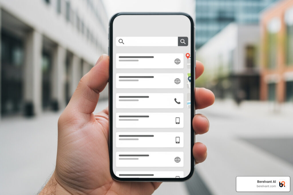
Understanding the difference between mobile and desktop user intent is crucial for optimizing your digital acquisition engine. Mobile users are often in “micro-moments”—they’re looking for immediate answers, directions, or solutions. Their searches tend to be more goal-oriented, often driven by location (e.g., “coffee shops near me in Fairfield, CT”) or urgency. They typically have shorter attention spans and less patience for slow-loading pages or clunky navigation.
This leads to different search engine results page (SERP) features on mobile, such as local packs, click-to-call buttons, and quick answer boxes, which are not as prominent on desktop. For enterprise clients operating in multiple markets across the Americas, tailoring content and user flows to these distinct mobile behaviors is paramount. We analyze these patterns to ensure your multilingual creative and automation systems are aligned with how users actually engage on mobile, driving higher conversion rates and improving your market position.
Architecting Your High-Performance Mobile SEO Optimization System
Building a scalable, high-performance mobile presence requires a systematic approach, not ad-hoc fixes. We architect the technical infrastructure for speed, usability, and conversions across all user touchpoints, ensuring compliance and efficiency in complex, regulated environments.
Foundational Configuration: Choosing Your Mobile Architecture
The first step in building a robust mobile SEO system is selecting the right architectural foundation. There are three primary ways to configure a website for mobile optimization:
- Responsive Web Design (RWD): This approach serves the same HTML code on the same URL regardless of the user’s device, but can display the content differently based on screen size using CSS media queries.
- Dynamic Serving: Here, the same URL is used, but the server detects the user’s device (via user-agent sniffing) and serves different HTML/CSS versions of the content. This requires the
Vary: user-agentHTTP response header. - Separate URLs: This involves creating a completely distinct mobile site, often on a subdomain like
m.example.com, with its own content and URLs.
Google recommends responsive design as it’s generally the easiest design pattern to implement and maintain. It uses a single URL, allowing easy sharing and linking without a separate “mobile” URL, and reduces common mobile site mistakes. This approach eliminates the need for redirection, speeding up load times, and saves resources when Google crawls your site as it only crawls the page once.
For enterprise operations, responsive design simplifies maintenance across vast content libraries and multi-country execution. While dynamic serving and separate URLs offer more granular control, they introduce complexity in managing content parity, canonicalization, and potential duplicate content issues, especially in multilingual scenarios. Our focus is on systems that offer long-term viability and ease of SEO control, making responsive design often the preferred choice.
| Feature | Responsive Design | Dynamic Serving | Separate URLs |
|---|---|---|---|
| Implementation Cost | Moderate | High (requires server-side logic) | High (duplicate content creation) |
| Maintenance Overhead | Low (single codebase) | Moderate to High (managing different versions) | High (managing two distinct sites) |
| Scalability Across Markets | High (inherently adaptable) | Moderate (requires careful localization for each version) | Low (significant effort for each market/language) |
| SEO Control | High (single URL, simplified indexing) | Moderate (requires Vary header, user-agent management) |
Moderate (complex canonical/alternate tag management) |
| Google’s Recommendation | Yes | No (unless necessary and well-managed) | No (unless necessary and well-managed) |
Engineering for Sub-Second Mobile Page Speed
In the digital world, speed isn’t just a feature; it’s a fundamental requirement for user satisfaction and search engine ranking. A single-second delay in mobile load time can reduce conversions by up to 20%. For our enterprise clients, this translates directly to lost revenue and diminished campaign performance. Our goal is to engineer for sub-second page speeds, which is achievable even with the average mobile load time in the U.S. having jumped to 27.06 Mbps.
We prioritize Google’s Core Web Vitals, a set of metrics measuring real-world user experience:
- Largest Contentful Paint (LCP): Measures loading performance (aim for under 2.5 seconds).
- Interaction to Next Paint (INP): Measures responsiveness to user input (aim for under 200 milliseconds). This has succeeded First Input Delay (FID) as a core metric. Poor INP scores often stem from long JavaScript tasks or inefficient event callbacks. We break long JS tasks into smaller chunks using the scheduler API and optimize callbacks.
- Cumulative Layout Shift (CLS): Measures visual stability (aim for under 0.1).
To achieve these benchmarks, we implement a multi-faceted approach:
- Image Optimization: Utilizing responsive images, lazy loading, and modern formats like WebP. Images should be compressed efficiently without sacrificing quality.
- JavaScript Optimization: Minimizing and deferring JavaScript execution, breaking down long tasks.
- CDN Strategy: Leveraging Content Delivery Networks to serve assets from geographically closer servers, reducing latency for users across the Americas.
- Minimizing HTTP Requests: Consolidating CSS and JavaScript files, and reducing unnecessary third-party scripts.
- Browser Caching: Implementing effective caching policies to store resources locally on the user’s device.

These technical optimizations are critical for building high converting websites that perform at an enterprise scale.
Designing a Frictionless Mobile User Experience (UX)
Beyond raw speed, a frictionless mobile user experience (UX) is paramount. Mobile users expect intuitive interfaces, easy readability, and seamless interaction. Google penalizes “intrusive pop-ups” that cover main content, specifically intrusive interstitial pop-ups, as they disrupt UX. This is not just a preference; it’s a ranking factor.
Our UX optimization focuses on:
- Tap Target Sizing: Interactive elements like buttons and links must be large enough (at least 48×48 pixels) and well-spaced to be easily tappable on a mobile screen. Targets smaller than this or those that overlap will be called out in Lighthouse reports.
- Readability Standards: Employing larger, legible fonts (e.g., 14-point minimum), ample white space (the blank space between text blocks, images, and margins), and high contrast between text and background. Content should be readable without requiring users to pinch and zoom.
- Simplified Navigation: Implementing clear, concise menus (e.g., hamburger menus) that are easy to access and steer.
- Streamlined Forms & Checkout: Minimizing input fields, using autofill, and offering diverse payment options to reduce friction in conversion funnels. For enterprise e-commerce, this is key to reducing cart abandonment.
- Content Presentation: Breaking up content into short paragraphs (2-3 sentences), using bullet points, and brief introductions to cater to mobile users’ scanning habits. While historically mobile sites sometimes had less content, it’s crucial that all authoritative content is available on mobile, re-ordered for readability if necessary.
Advanced Mobile Strategies for Market Domination
Standard optimization is table stakes. Market leaders leverage advanced strategies to capture emerging traffic sources and integrate mobile into a holistic growth strategy. This is where our expertise in AI automation and multilingual creative truly shines, allowing us to solve complex challenges in regulated and compliance-heavy environments.
Integrating Mobile and Local SEO for “Near Me” Supremacy
The intersection of mobile and local SEO is a goldmine for enterprise businesses with physical locations in areas like Westport, CT, or Fairfield, CT. Mobile devices are inherently location-aware, driving a surge in local intent queries, particularly “near me” searches. These searches often carry high commercial intent; 76% of local searches on smartphones result in a visit to a business within a day.
To achieve “near me” supremacy, we focus on:
- Google Business Profile Optimization: Carefully optimizing and maintaining your Google Business Profile (formerly Google My Business) listings for all locations, ensuring accurate and consistent Name, Address, Phone number (NAP) information across all online directories.
- Geo-targeted Content: Creating location-specific content that incorporates local keywords and addresses the unique needs of customers in Connecticut markets.
- Click-to-Call Functionality: Implementing prominent click-to-call buttons on mobile pages, making it effortless for customers to connect with your local branches.
- In-store Visit Attribution: Leveraging analytics to track the impact of mobile searches on physical store visits, providing a clear ROI for your local SEO efforts.
- Schema Markup: Using local business schema to provide search engines with structured information about your locations, services, and operating hours.
This integrated approach ensures that when a potential customer in Connecticut searches for a product or service you offer, your business appears prominently and provides a direct path to conversion. For more insights, consider leveraging a local digital marketing company like ours.

The Future of Mobile Search: Voice and AI Optimization
The landscape of mobile search is rapidly evolving with the rise of voice search and AI-powered interfaces. These are not distant trends; they are current realities that demand proactive optimization. Voice searches are typically longer, more conversational, and often phrased as questions (e.g., “What are the best places to eat in Westport, CT?”).
Our strategy for optimizing for the future of mobile search includes:
- Conversational Keywords: Moving beyond traditional keywords to identify and target long-tail, question-based, and conversational phrases that users speak into their devices.
- Structured Data (Schema.org): Implementing comprehensive schema markup (e.g., FAQ, HowTo, Article, Product schema) to help search engines and AI understand your content’s context and relevance. Research shows that pages with Article, HowTo, or FAQ schema are nearly 80% more likely to be cited by large language model tools (LLMs). This is crucial for gaining visibility in AI-generated answers and rich snippets.
- Optimizing for AI Overviews: As AI search visitors are projected to surpass visitors from traditional search by 2028, optimizing for AI Overviews is critical. This involves publishing high-quality, comprehensive content that directly answers user queries, writing for natural language processing (NLP), incorporating relevant statistics and expert quotes, and ensuring your information is up-to-date and accurate. AI Overviews can take up a significant portion of mobile SERPs, making direct citation a powerful visibility driver.
This forward-thinking approach, powered by our AI marketing strategies, ensures your enterprise remains at the forefront of mobile search innovation, leveraging AI as a speed and scale layer to accelerate delivery and multiply campaign impact.
Measuring and Scaling Mobile Performance Across Markets
What isn’t measured cannot be improved. This section outlines the framework for tracking mobile performance, reporting to leadership, and scaling success across diverse geographical and linguistic markets. For enterprise operations, a robust analytics and reporting infrastructure is non-negotiable.
Establishing Mobile-Centric KPIs and Reporting
We establish clear, mobile-specific Key Performance Indicators (KPIs) that align with your overarching business objectives. This goes beyond generic traffic numbers to focus on actionable insights:
- Mobile Traffic Segmentation: Analyzing mobile vs. desktop traffic in tools like Google Analytics 4 (GA4) and Google Search Console. We track the percentage of overall traffic from mobile devices (which, as we know, is currently over 60% of global web traffic) and monitor trends.
- Mobile Ranking Performance: Tracking keyword rankings specifically for mobile devices, understanding how your visibility differs from desktop.
- Core Web Vitals Scores: Continuously monitoring LCP, INP, and CLS scores for mobile to ensure a top-tier user experience.
- Mobile Conversion Rates: Analyzing conversion funnels on mobile devices, identifying drop-off points, and optimizing for better performance.
- User Engagement Metrics: Bounce rate, time on page, and pages per session for mobile users to gauge content effectiveness and UX.
- Technical SEO Health: Regularly auditing mobile site crawls, mobile usability reports in Google Search Console, and identifying issues like blocked resources or missing structured data.
Our reporting systems provide a clear, concise view of mobile performance, translating technical metrics into business outcomes for VP and Director-level stakeholders. This allows for data-driven decision-making and efficient allocation of resources across your multi-market campaigns.
Scaling Mobile SEO for Multilingual and Cross-Border Operations
For enterprises operating across the Americas, scaling Mobile SEO optimization involves navigating complex multilingual and cross-border requirements. Our expertise in multilingual creative and multi-country execution is critical here.
Key considerations include:
- Hreflang for Mobile: Correctly implementing
hreflangtags for different language and country versions of your mobile content. This is especially vital for sites using separate URLs, wherehreflanglinks must be managed separately for mobile and desktop versions. - Content Parity Across Languages: Ensuring that the primary content, metadata, and structured data are equivalent across all language versions of your mobile site. Google uses the mobile version for indexing, so any content discrepancies can impact rankings in specific regions.
- Localized User Experience: Adapting the mobile UX to cultural nuances and local preferences. This might include different payment methods, local imagery, or variations in navigation patterns.
- Centralized Analytics Dashboards: Implementing a unified analytics framework that provides a holistic view of mobile performance across all markets, allowing for efficient identification of trends and opportunities.
- Compliance: Ensuring all mobile SEO strategies adhere to local regulations and compliance requirements across the Americas, especially for regulated industries.
This systematic approach to scaling ensures that your mobile SEO efforts are not fragmented but integrated into a powerful, efficient acquisition system that performs seamlessly across diverse markets.
Conclusion: Your Mobile Presence as a Growth Engine
Mobile SEO optimization is not a one-time project but a continuous process of refining a critical component of your acquisition system. By architecting for speed, user experience, and emerging search behaviors—from local intent to AI-driven queries—your mobile presence becomes a powerful engine for durable, scalable growth. It’s about building a robust, compliant, and high-performing digital infrastructure that serves your enterprise objectives.
At Berelvant, we specialize in building these end-to-end acquisition systems for companies operating across the Americas. We integrate performance media, multilingual creative, automation, and analytics into one unified engine that drives measurable revenue growth. Our deep understanding of complex challenges in regulated industries, compliance-heavy environments, multi-country execution, and multicultural audiences, combined with AI as our speed and scale layer, ensures your mobile presence is not just optimized but a true competitive advantage. Partner with us to build your high-performance acquisition system.